How to Edit Button Functions
Buttons provide basic navigation and selection functions throughout each App. This tutorial describes how to create, delete and re-order buttons on a selected page. This tutorial also describes how to edit button functions. For information on how to change the appearance of buttons, go to Using the Element Editor.
Step 1 |
|
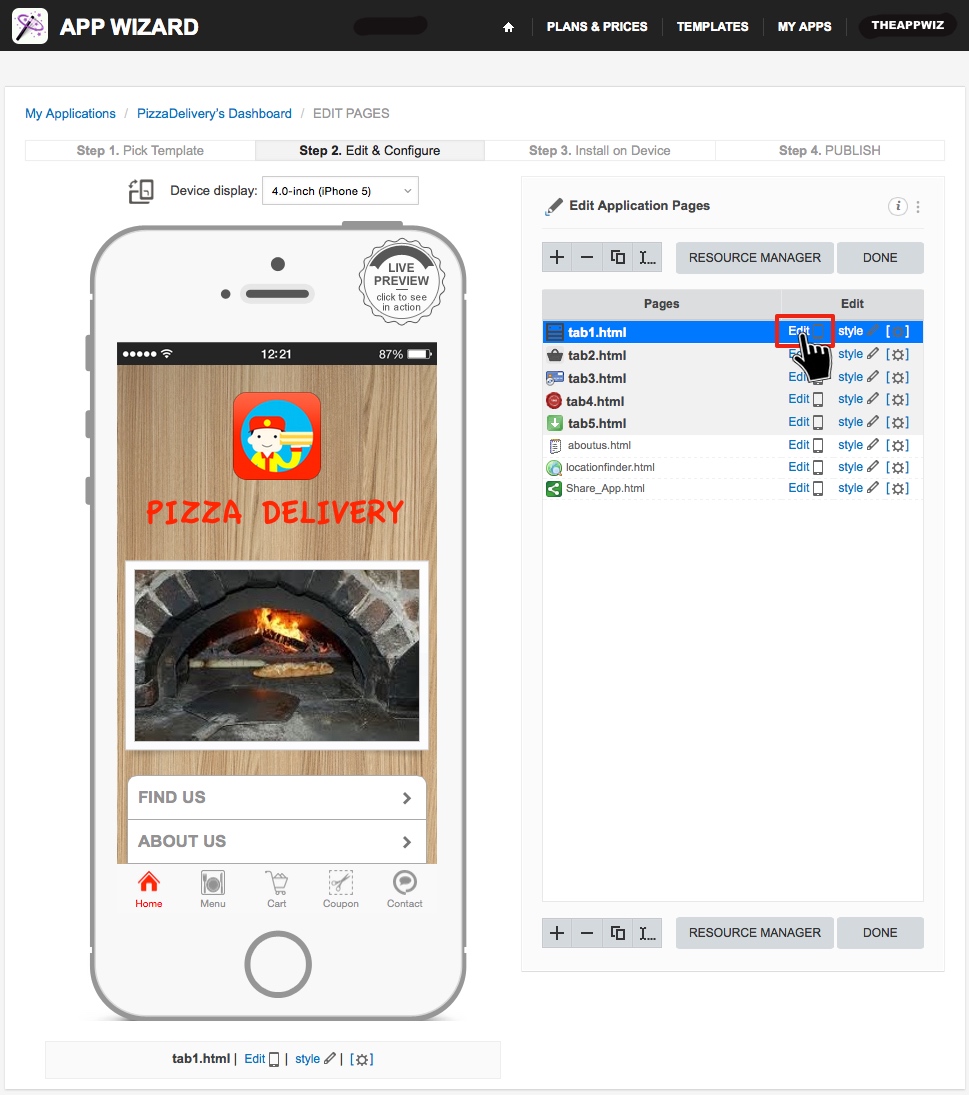
From the 'Edit Application Pages' screen, select the page that contains the 'button' you wish to edit. Click 'Edit' as shown above.
|
Step 2 |
|
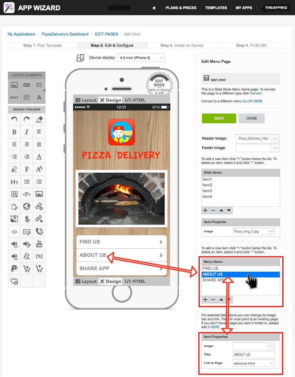
Menu Items Toolbox. After selecting the desired page in Step 1, the selected page will open for editing as shown above. The 'Menu Items' list contains each 'button' on the selected page. Each
button listed has a corresponding button shown on the 'handset display'.
Choose the specific button you wish edit from the 'Menu Items' list. In the example above, the 'ABOUT US' button is selected. Note: The 'Menu Items' toolbox provides three separate editing functions (add a button, delete a button and change the order of buttons). Each function is described separately below. |
'Menu Items Toolbox' - Add a Button |
|
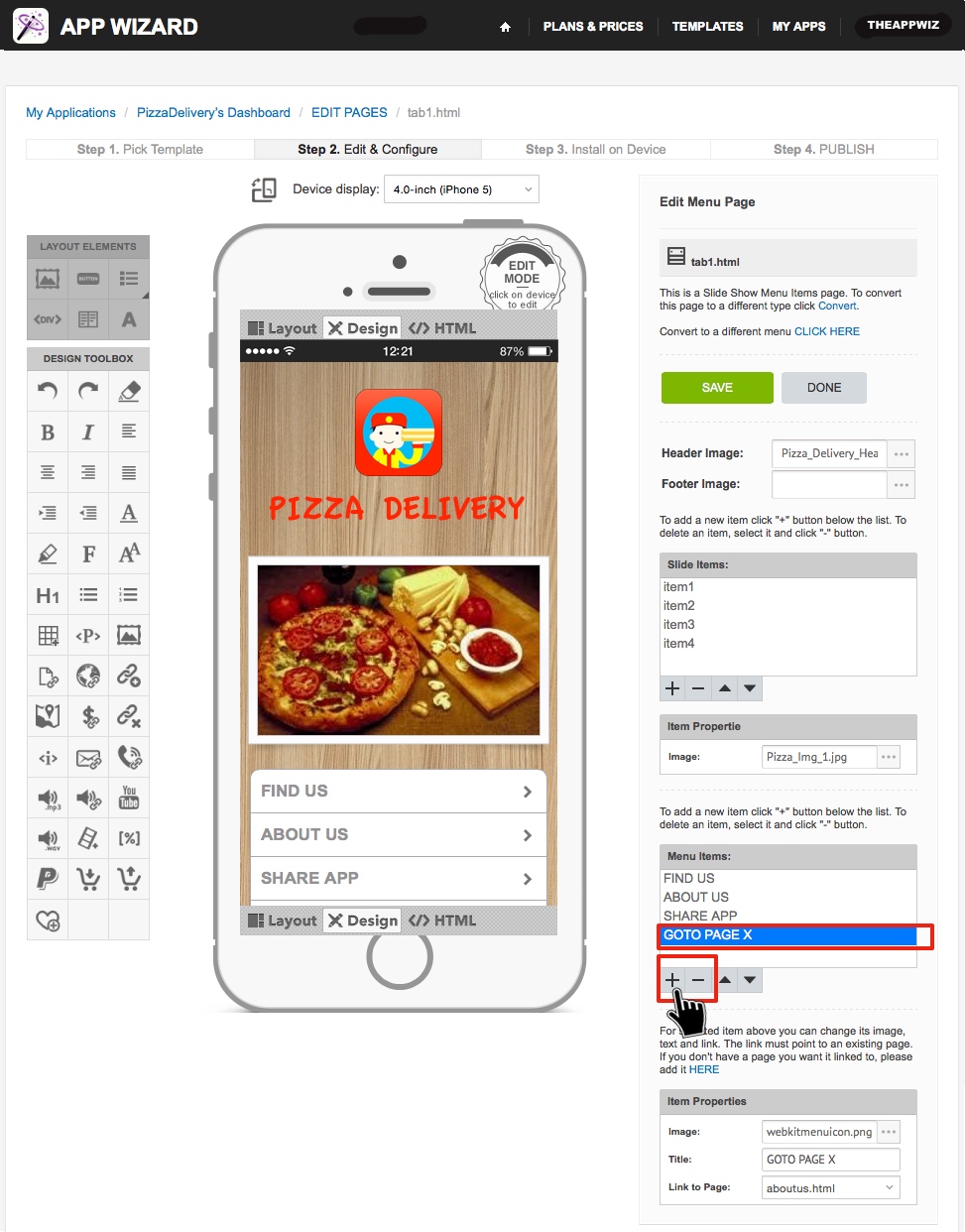
Add a Button. Add a new button to the page by selecting the 'plus' icon (+). The new button will appear in the list (e.g. GOTO PAGE X), as shown above. The new button will also appear on the
'handset display' after clicking 'SAVE'.
|
'Menu Items Toolbox' - Delete a Button |
|
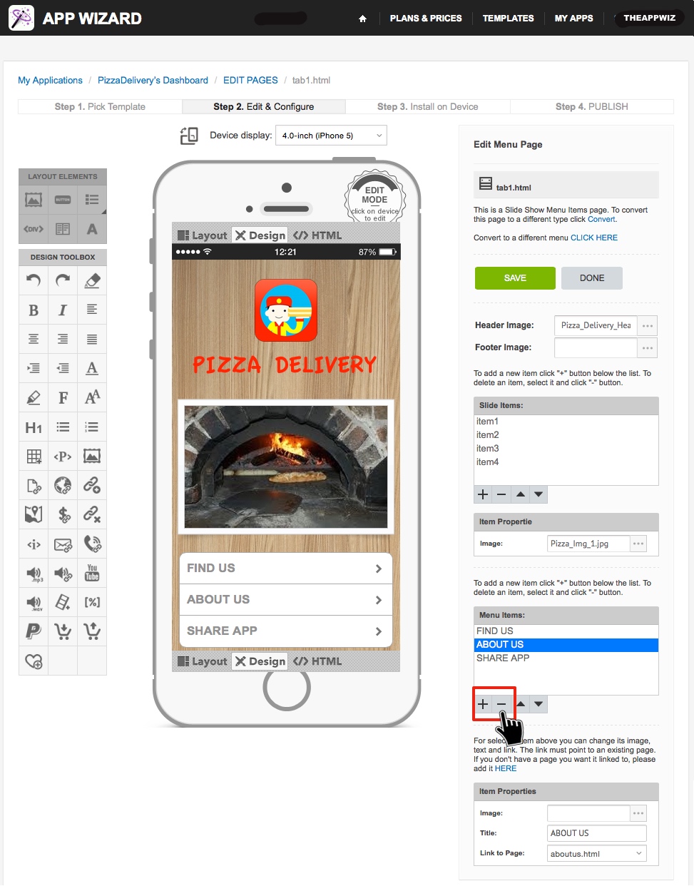
Delete a Buttton. Delete a selected button by clicking the 'minus' icon (-). If you accidentally delete a button, do not click 'SAVE'. Click 'DONE' and then click 'Cancel' to ensure page modifications
are not saved.
|
'Menu Items Toolbox' - Button Order |
|
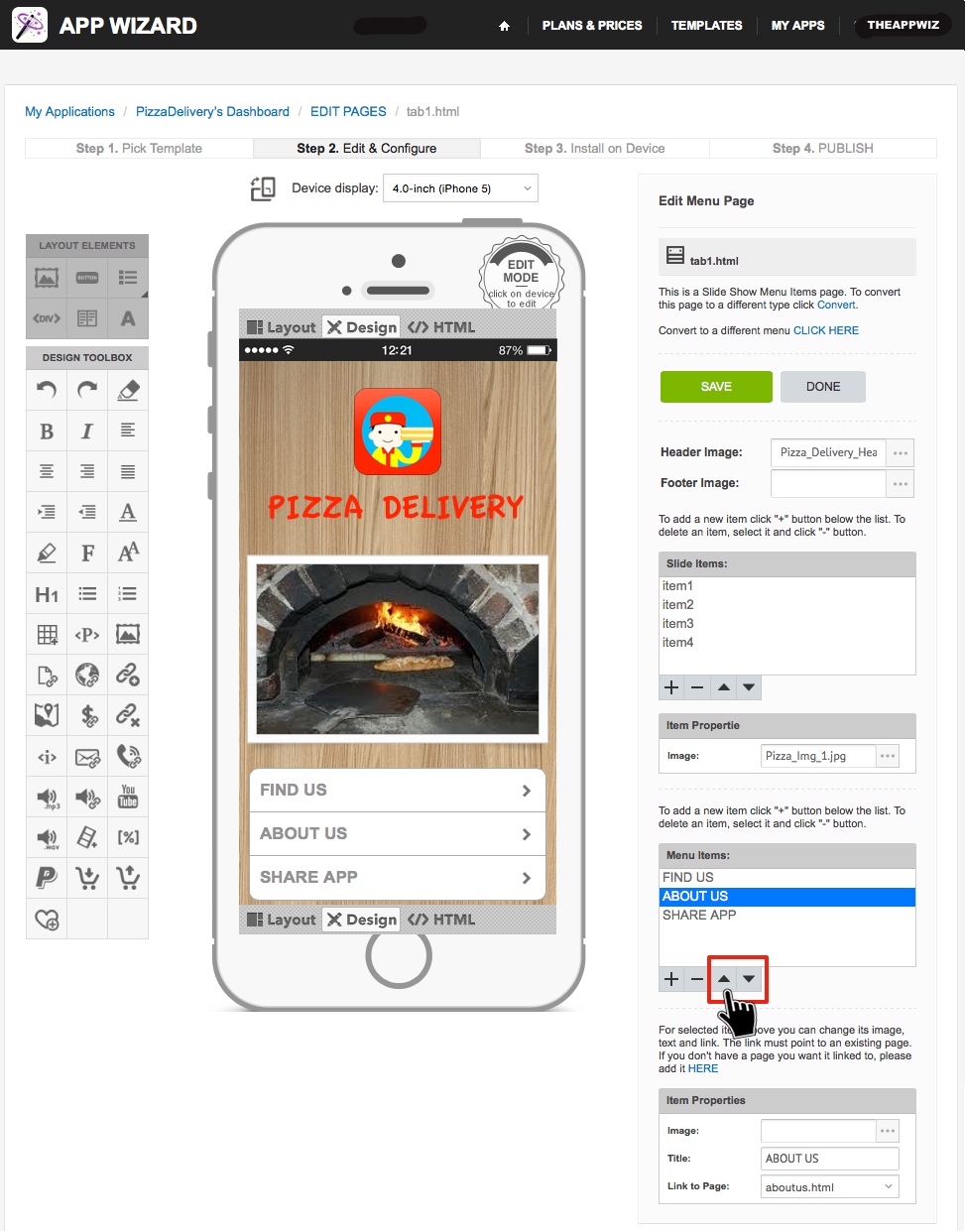
Button Order. After selecting a button from the list, click the 'up-arrow' or 'down-arrow' symbols (located below the 'Menu Items' toolbox) to move the selected button up or down the button
list.
Note: Changing the order of the buttons here will change the order they are displayed on the 'handset display'. Make sure 'Layout Mode' is selected on the 'handset display' to view changes. |
'Item Properties' - Image |
|
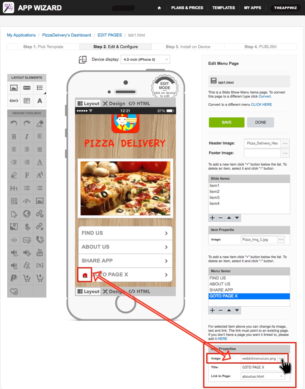
Button Image (Icon). To change an 'image' depicted on the selected button, first click the grey button on the right of the 'Image' field (in the 'Item Properties' toolbox) as shown above.
Button images are optional. To remove an 'image' from any button, simply delete all text from the 'Image' field in the 'Item Properties' toolbox, then click 'SAVE'.
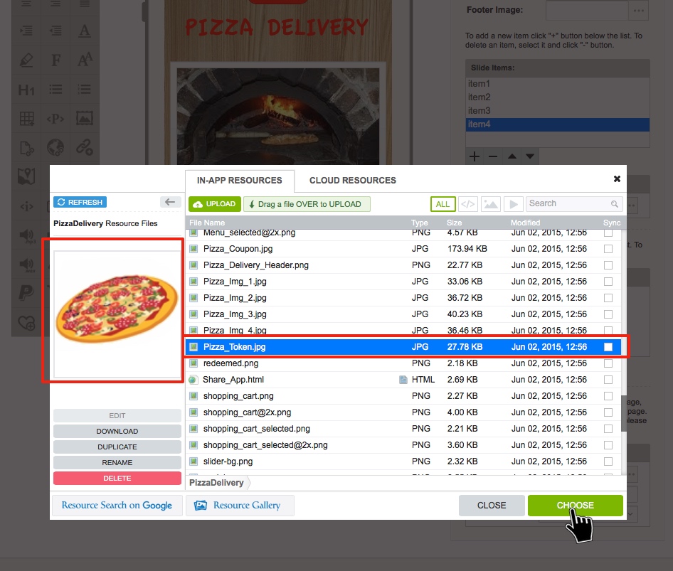
The 'RESOURCE MANAGER' window will open (as shown below). In this example, we are going to change the image of the 'GOTO PAGE' button (previously created by clicking the (+) symbol). |
'Item Properties' - Image (continued) |
|
Select the desired image file (or upload a new image file as required). Click 'CHOOSE'.
Note: For further information on adding an image to your App, go to How to Add a File to 'In-App Resources'. |
'Item Properties' - Title & Description |

|
Title. Enter the 'Title' for the button (e.g. GOTO PAGE X) in the 'Title' field.
Description. Some Buttons also contain a 'Description' for the button in the 'Item Properties' toolbox. The button 'Description' is optional and can be left blank if preferred. |
'Item Properties' - Link |
|
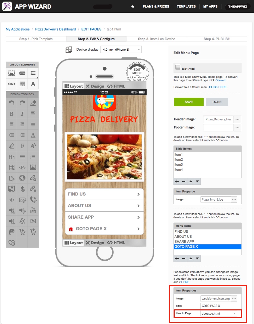
Link. The 'Link' property allows you to 'link' the button to a 'Page' in your App.
Note: The 'Link to Page' field (in the 'Item Properties' toolbox) allows each button to be linked to other pages in the App, however you can also link a button to a URL, an External URL, or other link types, by editing the same button using the 'Element Editor' on the page where the button is located. For instructions on how to use the 'Element Editor', go to Using the Element Editor. Once all the desired button properties have been edited, click 'SAVE' to apply changes. You can click 'SAVE' at any stage and return to finish later. After editing a button, you can check the changes on your device using the App Wizard Previewer. Refer to How to Download the App Wizard Previewer and How to Preview an App on Your Device, for further information. |
