Using the Element Editor

App Wizard templates are comprised of various elements for various functions or actions. 'Element Editors' are toolkits that allow an element's properties & functions to be edited. The following information helps App-builders understand how the 'Element Editors' work.
A detailed understanding of all features available in all 'Element Editors' is not required, however understanding the basic functions of each 'Element Editor' will help ensure the build process is trouble-free.
Step 1 |
Step 2 |
|
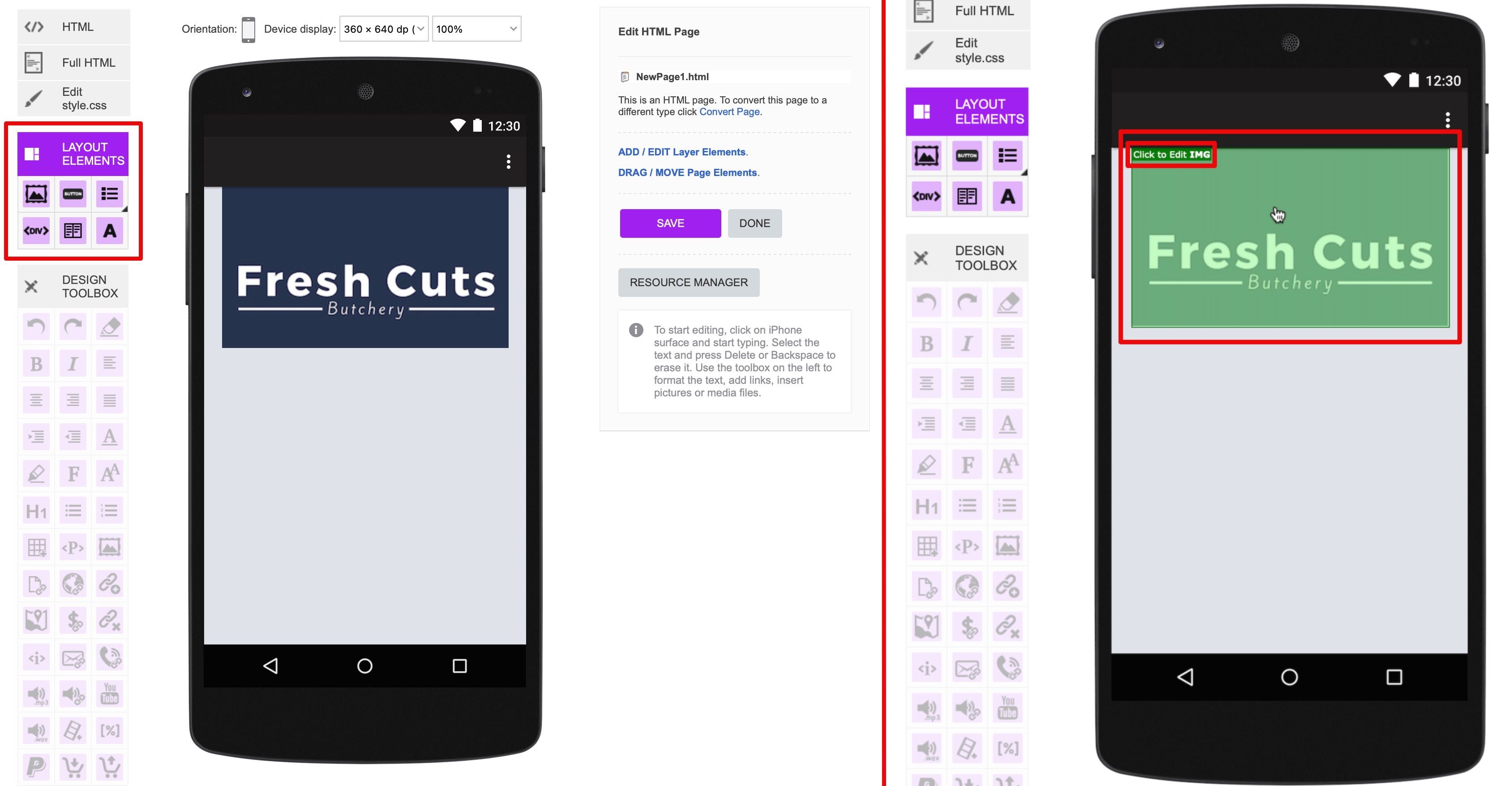
To open the 'Element Editor', select the page you wish to edit and select 'Layout' on the left of the 'Handset Display'.
|
Hover your cursor over the 'element' on the 'Handset Display' that you wish to edit. The 'element' will be highlighted (as shown above).
Click on the highlighted 'element' to open the 'Element Editor' window for that element. |
Step 3 |
'Editing IMG Element' |
'Editing A Element' |

|
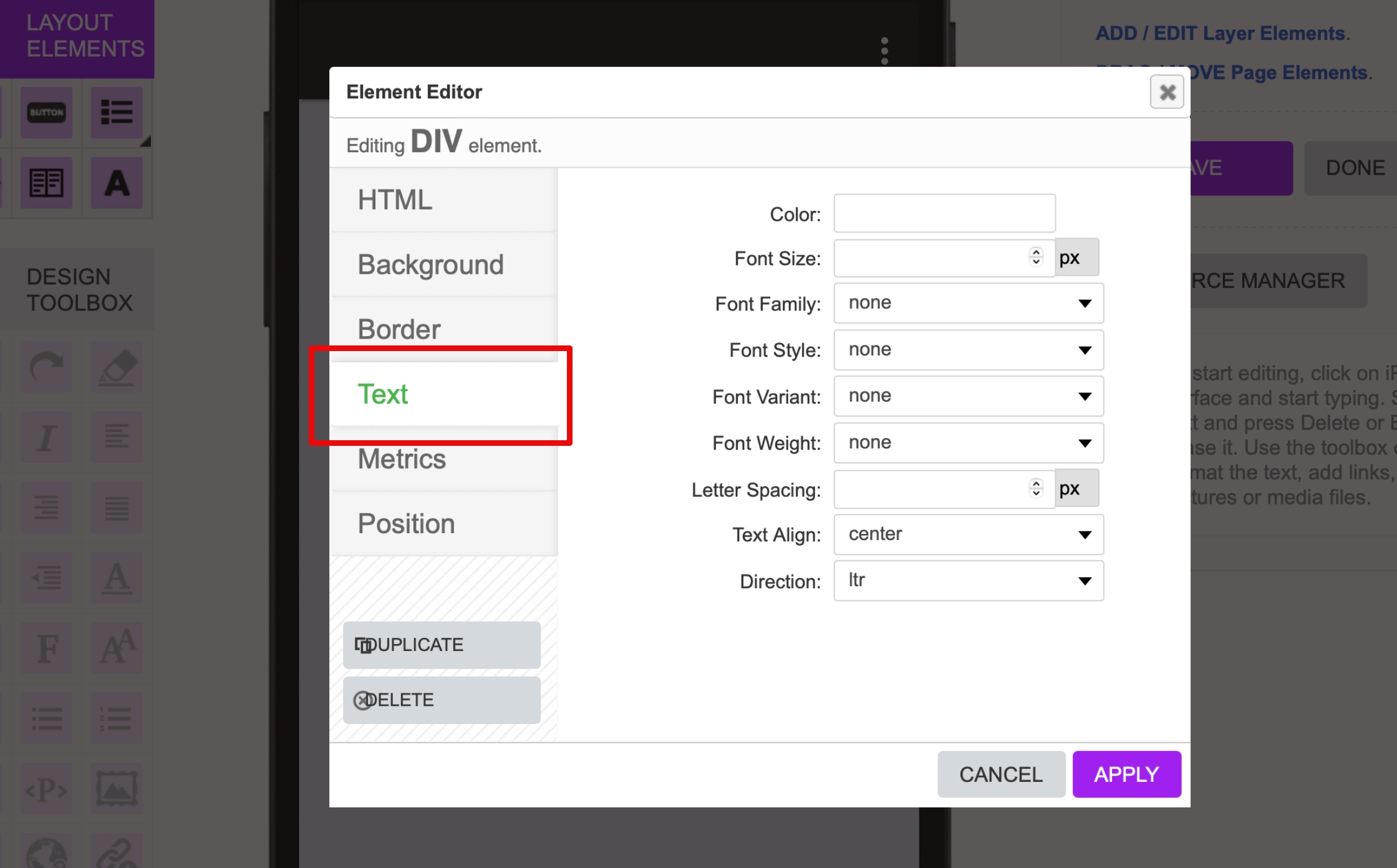
There are three main types of 'Element Editors'. The type of 'Element Editor' that opens depends on the type of 'element' selected. The different 'Element Editors' are summarised below:
a. Edit IMG. This 'Element Editor' allows you to edit images. 'Click to Edit IMG' will appear at the top of the 'image element' when you hover your cursor over it (on the handset display - as depicted in Step 2 above). 'Editing IMG element' will appear at the top left of the 'Element Editor' (as shown above left) after selecting (clicking on) an image element. b. Edit A. This 'Element Editor' allows you to edit buttons and their corresponding links. 'Click to Edit A' will appear at the top of the element when you hover your cursor over it (on the handset display). 'Editing A element' will appear at the top of the 'Element Editor' after selecting this type of element (as shown above right). c. Edit DIV. This 'Element Editor' allows you to edit spacing between elements in your App. 'Click to Edit DIV' will appear at the top of the element when you hover your cursor over a DIV element (on the handset display). 'Editing DIV element' will appear at the top of the 'Element Editor' after selecting this type of element. This type of 'Element Editor' is shown in Step 6 below. The 'Edit DIV element' editor also allows you to edit elements in your App which contain 'text', however to avoid layout complications, text is best edited directly into the handset display using the toolbox available in 'Design' mode (such as the text indicated in the Edit Text Tutorial). For more information, go to How to Edit Text. Important: When you select an element on the handset display, please check that the 'Element Editor' that opens corresponds with the same Element type you selected. For example, check that the 'Editing IMG element' Editor appears after clicking on an image in your App (and not the 'Editing DIV element' editor etc.). Sometimes it is easy to inadvertently select a 'DIV' when you meant to select an 'image' on the handset display - be careful when selecting elements in the handset display. If the wrong element editor opens, simply close the editor and try again. Note: You cannot edit (change) an 'image' that is associated with a 'button' by using the 'Editing A element' editor. For information on how to change the image on a button, go to How to Edit Button Functions. Remember: Although using the 'Element Editors' is generally intuitive, we acknowledge that the element editing process can complex until you are familiar with editing the different types of elements. Further information is provided for each 'Element Editor' below. If you have any problems along the way, please contact the App Wizard Build Team for assistance. |
Step 4 - 'Editing A Element' |

|
The following information explains the process to edit an element after selecting either of the 'pencil icons' (depicted as (1) or (2) in the right-hand image in Step 3 above). This process is normally applicable
when editing a button in an App (i.e. when using the 'Editing A element' editor).
After clicking on a button element on the handset display in your App and opening the corresponding 'Element Editor', click on either of the 'pencil icons' (as previously described). The 'Action' dialogue
box will appear (as shown above).
Click in the 'Action' field to open a drop-down list of link types. Select the desired link type as required. Each link type may require additional information to be entered in other fields in the 'Action'
dialogue box to ensure correct functionality (e.g. the destination telephone number etc.).
In the example shown above, we have selected the 'tel' (telephone) link type. This process will change the functionality of the button so that it will link to a telephone number when tapped on the device. For more information on how to change this particular
link setting, go to How to Edit Telephone Links.
Note: Not all the link types available in the drop-down list are applicable to the entire App template range. We recommend using only the following link types: 1. Page - links a button to a another page in your App. 2. External - links a button to an external website. The default browser is used by the device to access the external link. The App must be re-opened to continue. 3. Facebook - allows the App-user to access a specified Facebook page (without the need to include an internal Facebook page in your App). 4. Map - provides a link to a GPS map page with satellite imagery (e.g. Google Maps). 5. Xvideo & Movie - are used to incorporate video clips in your App. Note: The process to edit a link associated with a button is not required in order to build an App (when using any of our App Wizard templates), however the ability to edit button links is provided for anyone that wish to customise their App and change the default settings. For example, you may wish to change any default link from an SMS (Text Message) link, to a telephone link instead (as described in this step). App-builders are free to utilise any of the other link type options provided, however tutorials are not provided for other link types. These features are generally provided for advanced users only, however if you require help, please contact the App Wizard Build Team for assistance. |
Step 5 - 'Editing IMG Element' |

|
As described in Step 3 above, the 'Editing IMG element' editor is used to edit image files. The 'Element Editor' shown in the image above will appear after selecting an image file on the
handset display in your App. To edit (i.e. insert or replace) an image, select the 'HTML' tab on the left of the editor, then click on the pencil icon (circled above) to open the 'Resource Manager' (shown
in the next step below).
|
Step 5 (continued) - 'Editing IMG Element' |

|
After clicking on the pencil icon and opening the 'Resource Manager' (as described in the previous step), upload the desired image or select an image from the files already uploaded into the 'Resource Manager' as
required.
For more information on how to add an image file to your App's 'Resources', go to How to Add a File to In-App 'Resources'. If you are following this process in order to
edit any page containing images in your App, go to How to Edit Page Images for further information specifically regarding image editing.
|
Step 6 - 'Editing DIV Element' |

|
The third type of 'Element Editor is mainly used for editing the spacing between elements on a page in your App. This type of 'Element Editor' indicates 'Editing DIV element' at the top
left of the editor (as shown above).
To edit the spacing between elements, select the relevant DIV element on the handset display to open the corresponding 'Element Editor'. Select the 'Metrics' tab on the left side of the editor. Enter
the desired settings (e.g. height, width, margin or padding fields) for the selected DIV element.
Some DIV elements in App Wizard templates contain text. The text is indicated in corresponding field in the 'HTML' tab of the 'Element Editor'. As indicated in Step 3 above, text contained in your App should not be edited using the 'Element Editor'. All text fields in App Wizard should be edited in 'Design' mode via the handset display. For further information on editing text elements, go to How to Edit Text.
Some DIV elements in App Wizard contain other elements (such as image elements). Do not delete DIV elements that 'house' other elements. When editing individual image elements, be sure to select the image element (and not a DIV element which 'houses'
the image). 'Click to Edit IMG' will appear (at the top of an image) when the cursor is hovered over an image element on the handset display. 'Click to Edit
DIV' will appear (at the top of a DIV element) when the cursor is hovered over a DIV element on the handset display. Always make sure the corresponding 'Element Editor' opens as described in Step 3 above.
Note: The text that appears in the top banners of some pages cannot be edited using the 'Element Editor'. For information on how to edit this type of information, go to How to Edit Text.
Note: Editing spacing can cause layout complications. Changing the layout / spacing is not required when building an App from the App Wizard range - the element spacing is already optimised
for all Apple and Android handsets. If you intend to edit element spacing and customise your App further, always check the results of changes to element spacing on the handset display, or by using the
App Wizard Previewer App to ensure the final layout is displayed as intended. For further information on using the App Wizard Previewer, go to How to Preview an App on Your Device.
|
Step 7 - Other 'Element Editor' Functions |

|
The properties of each element type (e.g. DIV, IMG or A elements) can be edited using the tabs in the relevant 'Element Editor' (as circled in the image above). The tab list is the same in each 'Element Editor'.
The following steps provide further information on the editing features available in each tab, however most of the default settings in each tab do not require editing when building an App from an App
Wizard template.
|
Step 7 (continued) - Background Tab |

|
The 'Background' tab allows you to place a colour or image in the background (of the element). The 'Background' editing feature is not normally required when building an App from an App Wizard template, however
App-builders can edit the background as required to suit a particular marketing profile. Editing the 'Background' settings for elements is recommended only for experienced users that want to fully customise
the design of their App.
|
Step 7 (continued) - Border Tab |

|
The 'Border' tab allows you to place a border around elements in the App, including images, text and buttons. The 'colour', 'width' and 'style' of the border can be edited via this tab. Element borders are not normally
included by default in App Wizard templates, however you may wish to utilise this feature to customise the design of your App if preferred.
|
Step 7 (continued) - Text Tab |
|
The 'Text' tab can be used to change the size, color, alignment, letter spacing and font particulars associated with elements containing plain text, however as described in previous steps, text incorporated into
App Wizard templates should be edited via the toolbox available in 'Design' mode directly in the handeset display. The text editing features available in the Text tab in the 'Element Editors' are provided for
advanced users only.
|
Ste 7 (continued) - Metrics Tab |

|
The 'Metrics' tab can be used to change the size of an image element in your App, without the need to resize the original source image. The 'Metrics' tab also allows you to edit margin and padding
settings (however these settings should not be edited if you are unfamiliar with their function).
In most App Wizard templates, the 'Width' setting is normally purposefully set to suit the default images. Limiting the width (or height) of images ensures they display correctly on devices. See below.
The example image above shows the the width of an element set at 280 pixels. Note that the 'Height' setting does not need to be set as the height of the image will be automatically resized to preserve the original 'aspect ratio' of the image, based on
the specified 'width'. Similarly, if you wish to limit the 'height' of an image, specify the desired height (in the height cell) and leave the width cell blank - the width will be automatically adjusted to preserve
the original 'aspect ratio' of the image. This feature minimizes the amount of editing required. Alternatively, both the width and height settings can be specified, however the settings must reflect the correct
'aspect ratio' to avoid image distortion.
|
Step 7 (continued) - Position Tab |

|
The 'Position' tab is used to edit (move) the location of an element on the relevant page in your App. The default 'Position' settings in App Wizard templates should only be edited by advanced users who are familiar
with absolute and static positioning and wish to fully customise their App.
Note: The 'Position' tab should not be used to change the positon of buttons. To learn how to change the position of a button, go to How to Edit Button Functions.
|